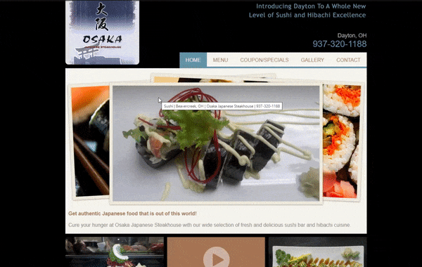
Osaka Japanese Steakhouse Website

Timeline
June 2023 - August 2023 (2 months)
PROBLEM
Restaurant website can discourage new customers from visiting
The restaurant owners of Osaka Japanese Steakhouse felt that the current website design and user experience was discouraging new customers from coming in, preventing them from expanding their customer base past locals and regulars. How could I design a new website that attracts and encourages customers to visit and increase their revenue?
SOLUTION
33%
have been turned off by difficult navigation
30%
have been turned off by websites that look old and outdated
USER INTERVIEWS
On mobile:
Find the Coupons/Specials.
Take a look at all the pictures of the food they offer.
Afterwards, I asked them:
What was your overall feel of the website?
Which tasks were easy? Which tasks were hard? Why?
Are there any specific features of the website that you didn’t like/thought were frustrating?
MAIN INSIGHTS
Users noticed a lack of usability and felt unwelcomed by the disorderly website
Similar to my findings from the white paper research, my interview findings revealed that the website’s usability was not great. Another important finding was also revealed - first impressions and emotions are heavily evoked by not only the aesthetics and visuals, but equally by the structure of content.

DESIGN

ITERATION TESTING + IMPROVEMENTS
3 major design improvements
Through feedback from my peers and interviewees, I continued to iterate on my designs, in which I made some significant changes:
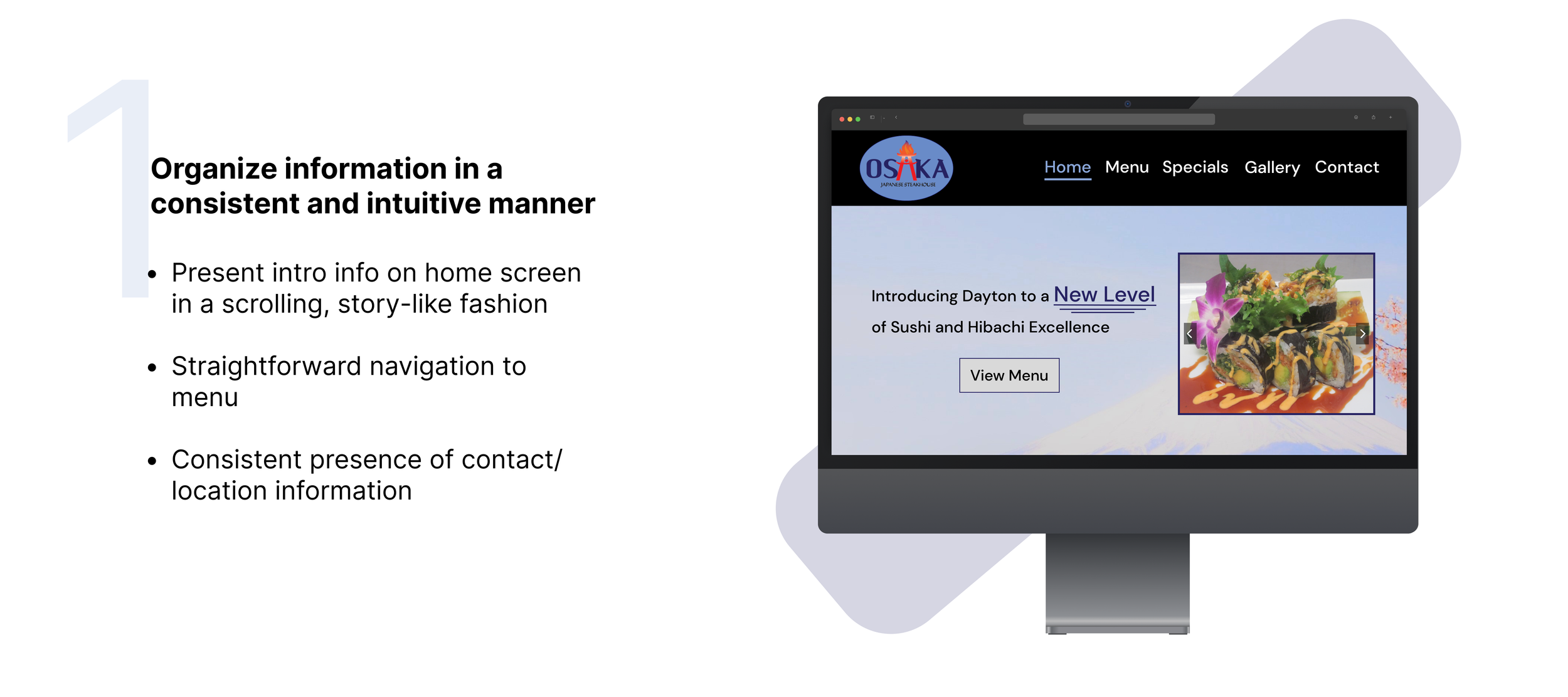
Build a more usable, navigable website optimized for any device while emphasizing brand identity


Lack of ease of navigation and mobile functionality can discourage a large amount of customers
My Role
Starting with white paper research, I explored reasons as to why new restaurant customers might not like or might be discouraged from trying out a restaurant based on their website. I managed to uncover two main reasons based on a survey done by MGH, a full-service marketing communications agency:
Design and develop website
“
WHITE PAPER RESEARCH
56%
of diners say mobile-friendly websites
are very important36%
have been discouraged from ordering
food from a restaurant because its
website wasn't mobile friendly
”
Although I already had two very important insights on what makes a good restaurant website from the white paper research, I still needed to capture the more emotional aspect from users using the website, as well as discover any feedback I could immediately use when designing the new website.
On desktop/laptop:
Find and open the menu.
Find the Friday business hours.
I decided to have four users complete four tasks based on what I thought new customers would most likely try to accomplish on the website, while also allowing them to explore throughout the whole website:
I decided to create the color palette around the logo’s purple and light blue colors, adding grays, white, and black to contribute to a more professional look of the website and identity of the restaurant.
For the text, I decided to use the sans-serif font ‘DM Sans’ for its readability and its professional presentation. I kept the font for both the headings and body text and differentiate them based off of font weight and font size because I wanted to keep the website look consistently modern.


FINAL SCREENS


Website available at osakasteakhouseoh.com
REFLECTIONS
Lessons learned & things to keep in mind for next time
Interview some new users. Getting feedback from people you’ve already interviewed before is good to show you’ve made some sort of improvement, but it’s also important to get new perspectives and opinions from people who haven’t seen the product yet, since they don’t have the bias of the original design to go off of. Not only can you gain insight into whether or not you have sufficiently solved your problem, but also open your eyes to new avenues of solutions.
Breadth of ideation is key. When I started making wireframes in the design process, I started with one design for each screen and continued to iterate off of that one design. I wish I had been more open-minded to different design ideas and made different wireframe designs. The first idea isn’t always the best idea, and continuing to build off that can lead to not being able to solve the problem efficiently. However, if you have multiple ideas, you can choose to hone in on one from a wide variety of possibilities that best suits its needs. But, I was lucky enough to have it work out in this case.
Don’t start development until design process is complete. Although this isn’t fully related to the process of UX design, given the limiting time constraints and my responsibility of developing the website as well, I got a little too excited and started to develop alongside the design process, even when it was only around 70% complete. It caused a lot of messy back-and-forth editing and revising between the two processes, which, against my intentions, actually lost me more time. I’d need to be a little more process driven next time and focus my attention on finishing the design aspect before development.
Enjoy the journey - iteration exists for a reason. Being my first UX project, I was pretty stressed out, as I wanted to make the final product as perfect as possible. This mentality carried on to each step of the iteration process, where I would do my absolute best to get the iteration to be “perfect”. But the mentality of perfection is contradictory to the concept of iteration, where there is constant improvement to the product in each stage. It’s a life lesson learned for me too: Have fun and focus on the journey, not just the destination.